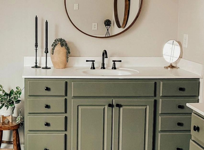
You know that feeling when you walk through a herb garden? The air is clean, the greens are varied and deep, and there's a sense of quiet calm. That's the essence of rosemary color. It's not just a single shade you pick from a paint deck. It's a whole mood—a sophisticated, grounded green that sits perfectly between the trendy sage and the classic forest green. I've used it in client projects for years, and it consistently delivers a space that feels both refreshed and timeless. Let's break down why this particular green is having a moment and, more importantly, how you can use it without it looking like everyone else's Pinterest board.
What You'll Find Inside
What Exactly Is Rosemary Color?
Think of the actual rosemary herb. Its needles aren't a bright, lime green. They're a dusky, grayish-green with hints of blue and silver. That's your baseline. In the world of interior design and paint, rosemary green has become a catch-all for a range of muted, natural greens that evoke that herbal, earthy quality.
Where people get confused is assuming it's identical to sage. It's a close cousin, but not a twin. While sage often leans softer, dustier, and sometimes a bit more yellow, rosemary typically carries more gray or blue undertones. It feels a touch cooler, a bit more serene. According to color psychology resources, greens in this family are associated with restoration and balance—exactly what we want in our homes.
To make it concrete, here's how some major paint brands interpret this popular green shade. Notice the subtle differences in undertone—they make all the difference on your walls.
| Paint Brand & Color Name | Key Characteristics | Best Used For |
|---|---|---|
| Sherwin-Williams Rosemary (SW 6187) | A balanced, medium-toned green with subtle gray undertones. The "safe bet." | Whole rooms, especially bedrooms and studies. Pairs well with warm woods. |
| Benjamin Moore October Mist (1495) | Lighter and more ethereal. A gray-green that feels like a soft morning fog. | Making small spaces feel larger. Excellent for ceilings or trims with a darker wall. |
| Farrow & Ball Green Smoke No. 47 | Deeper, more dramatic. Has a historic, almost smoky blue-green depth. | Accent walls, libraries, dining rooms. Creates instant mood and sophistication. |
| Behr Bitter Sage (S380-5) | As the name hints, a slightly more yellow-based, "drier" herbal green. | Sun-drenched rooms (south-facing). Brings warmth without being overwhelming. |
How to Use Rosemary Color in Home Decor
Okay, you've found your shade. Now what? The biggest question I get is, "Will this make my room look dark?" Not if you use it strategically.
Start Small (The No-Commitment Approach)
If you're nervous, don't paint a wall. Bring in rosemary green through decor. This is your testing phase.
Look for a velvet pillow in that exact hue. A chunky knit throw. Ceramic vases or table lamps. I once found a set of linen napkins in the perfect gray-green that inspired an entire dining room refresh. The goal is to see how the color plays with your existing sofa, flooring, and light throughout the day. Does it look dull or vibrant? Does it clash with your wood tones? This live test is worth more than a hundred paint chips.
Go Big (The Transformative Power of Paint)
When you're ready for paint, consider the room's function and light.
North-facing or low-light rooms: Choose a rosemary green from the lighter end of the spectrum, like October Mist. Avoid the deep, blue-heavy versions—they can feel chilly. Pair it with lots of creamy whites and warm metallics (brass, gold) to add light and warmth.
South-facing or bright rooms: You have more freedom. A deeper shade like Green Smoke can look incredible, absorbing some of the excess light to create a cozy, enveloping feel. It makes a sunny living room feel intentional, not just bright.
The accent wall debate: I'm not against them, but be smart. Don't just paint the wall behind your TV. Paint the wall with the architectural interest—the one with a fireplace, built-in shelves, or beautiful windows. The color should highlight a feature, not just be a random block.
The Perfect Plant Pairings for a Rosemary Color Theme
This is where the magic happens. A rosemary-colored room without plants is like a cake without frosting—good, but missing its best part. The goal is contrast and texture, not camouflage.
For High Contrast & Drama: Use plants with white or cream variegation. A Marble Queen Pothos trailing from a shelf against a deep green wall is stunning. The white in the leaves pops against the green, and the glossy texture adds life. A Snake Plant (Sansevieria) with yellow edges (like 'Laurentii') works on the same principle—architectural shape, bright contrast.
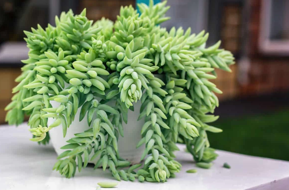
For Textural Harmony: This is for a more subtle, tonal look. Pair the wall with plants that have a similar muted quality but different textures. Blue Star Fern has a beautiful blue-green, almost dusty hue. String of Pearls offers a completely different form—cascading spheres of gray-green. Together, they create a layered, cohesive feel without being matchy-matchy.
The One to Avoid (My Pet Peeve): Don't put a dark green, non-variegated Monstera Deliciosa or Rubber Plant (Ficus elastica) directly in front of a similarly dark rosemary wall. From across the room, they'll blend into a dark, shapeless mass. Lift them up, put them in a lighter corner, or choose a brighter companion plant instead.
Common Mistakes to Avoid (From a Designer's Notebook)
I've seen these happen. Let's skip the headache.
Mistake 1: Ignoring the Undertone of Your Wood. You have orange-toned oak floors or cherry cabinets. Pairing them with a rosemary green that has strong blue undertones can create a jarring, unintentional color clash. Look for a rosemary with a hint of yellow or gray-beige in it—it will bridge the gap between the warm wood and the cool green beautifully.
Mistake 2: Using it with the Wrong White. Slapping a bright, cool white trim (like Pure White) next to a warm, earthy rosemary green can make the green look dirty. Match the undertone. If your green is warm (yellow-based), use a warm white (like Swiss Coffee). If it's cool (blue-based), use a cool white (like Chantilly Lace). This creates a seamless, expensive look.
Mistake 3: Overcommitting in a Rental. You love the color but can't paint. Go all-in on removable decor. Peel-and-stick wallpaper in a rosemary green pattern on one wall. A large area rug with green tones. Curtains, bedding, slipcovers. You can saturate a space with the color without touching a single permanent surface.
Your Questions, Answered
 Is rosemary green a good color for a home office?
Rosemary color isn't a passing fad. It's a return to colors that feel connected to the natural world. It has the depth to be interesting and the calm to be restful. Whether you dip a toe in with a new throw pillow or dive in headfirst with gallons of paint, it's a choice that brings a sense of peace and grounded style to your home. Start with a sample, observe it in your light, and build from there. Your own herb garden oasis is waiting.


Comments